What do kitschy paint-by-numbers kits, Japanese kimono design, animated beer signs, and mood rings have to do with old school video games? The answer, if you’ve been paying attention, is palettes. In this post, we’ll look at how and why palettes exist, what affordances they offer, and insight into this lost art.
Though rarely used in today’s development, palettes–color look up tables built into the video display hardware–played an important role in early 8- and 16-bit hardware, and continued to be used well into the era of 3D-acceleration.
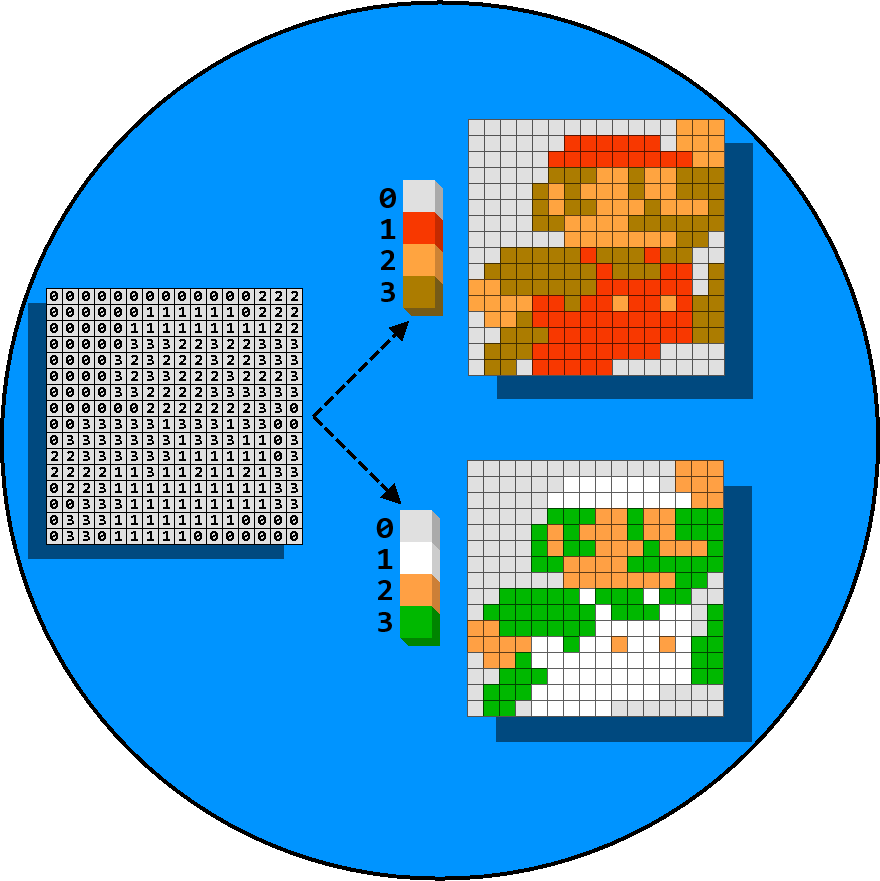
As an analogy, think of a paint-by-numbers kit:
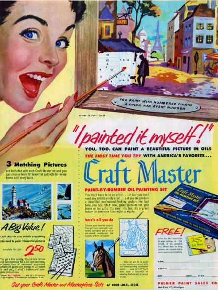
“I Painted it Myself!” Courtesy of the Paint By Numbers Museum.
The image is made up of regions, identified with numbers, each of which correspond to a particular color. This makes it very easy to reproduce the image, and even easier to store it. If we move this into the realm of the digital, we need only store the color’s index for each pixel rather than the individual red, green, and blue components that make up the image. The video hardware does this look-up as it draws the screen, translating the index into signals to the electron gun inside the TV.
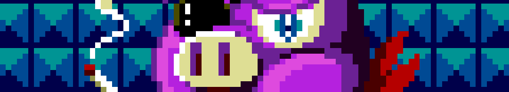
When people use the term “palette swap,” what they’re talking about is specifying a new set of colors for the indexes. In the image at the top of this post, Mario and Lugi use the exact same paint-by-numbers values in Super Mario Bros., but simply change how those numbers are interpreted.
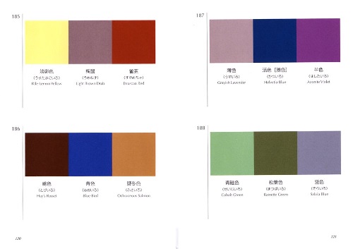
The concept of pre-selected color packages wasn’t anything new, of course. One of my favorites is Sanzo Wada’s 1933 Haishoku Soukan, a 6-volume set which laid out palette selections for kimonos and other Japanese fashion.
The classic graphics text by Foley & Van Dam cites palettes as a commonly used technique in display processor technology: Barring the gory details, palettes reduced the memory footprint of images significantly and also eased memory bandwidth issues. For cheap hardware in the 80s, maximizing the CPU was paramount, which meant offloading work into auxiliary chips and keeping the memory bus freed up.
As an example, the IBM PC VGA standard could display 18-bit colors (6 bits each Red, Green, Blue). A 100×100 pixel image at 18-bits turns out to be 22,500 bytes. However, if we use an 8-bit palette (256 entries, each entry mapping to an 18-bit color as before), our 100×100 image turns out to only need 10,000 bytes…a dramatic savings!
So while our overall number of unique colors decreases, we can employ some of the same tricks that newspapers learned long ago: by putting colors adjacent to each other, we can trick the eye into seeing more than is actually there, or even to seemingly generate new colors altogether. Known as “dithering,” this artform can produce some staggeringly deep visuals using only a handful of unique colors.
Dithering used to great effect in Castlevania: Circle of the Moon. This image uses only 5 colors! For more dithering magic, check out Dan Fessler’s amazing Photoshop plugin.
Some machines had hard-coded color values: On the ZX Spectrum, palette entry 0 was always black, palette entry 1 was always dark blue, etc. Pac-Man has its color palette stored in a special PROM. Other devices allowed the programer to specify the mapping of index to color value and dynamically change them at runtime. This led to cool special effects such as fading the screen to black (interpolating all colors in the palette towards black), flashing a character white when struck (by setting all of their colors to white for several frames before restoring them).
One could even achieve animation through palette changes. A mood ring, for example, changes the surface of the ring as the bearer’s mood–ahem–changes. By isolating color values in the palette in a video game, you can make a sword pulse with magical energy by making just that color index change over time. If you ever saw a character steadily change to red as he was injured in a game, you saw this technique being used.
Motion can also be conveyed through palette changes. The old Hamm’s beer signs (I knew you were waiting for that one) rotated colors to give the illusion of flowing water, or day turning into night and back to day again. By dedicating a swath of colors in the palette, we can use color cycling to emulate motion.
Joe Huckaby and Mark J. Ferrari use palettes to fantastic effect for animation and time of day. Be sure to visit their Living Worlds site to play with this interactively!
More ambitious coders pulled off strange tricks to display more colors than would normally be possible: waiting for a specific scanline and then re-loading the palette with a new set of colors.
Charles MacDonald’s 64 Color Palette Test Program draws the top half of the screen using 32 of the available colors, and then reloads the palette registers midway down the screen to draw the other 32.
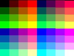
The mappings were also limited to what the device could actually display: the NES was only capable of outputting 64 colors drawn from the NTSC standard, and of those, only 54 were unique. The Genesis could output 512 colors from the RGB spectrum (3 bits each Red, Green, and Blue). Some 3D accelerator cards had oddball palette support, such as 5-bits red, 6-bits green, and 5-bits blue.
As the hardware evolved, we started to see more and more specialization: Moving objects (“sprites”) used their own palettes (or section of a larger palette) while the grid-like background (“BG”) used another one. On the NES, the sprite and background palettes are totally distinct: sprites use one of 4 4-color palettes, and each BG tile uses one of 4 totally different 4-color palettes. The Master System allowed BG tiles to use either of its two 16-color palettes, but sprites could use only one of them. To make matters weirder, palette entry #0 is often used as a hardware “clear” color for sprites only, letting the background show through.
In terms of how these palettes were used in practice, here are the most common approaches:
- Specify the palette up front and force all artwork to conform to this. I’ve heard horror stories from artists about the impact of changing a single color on Ultima VII‘s fixed 256-color palette.
- Dedicate swaths of the palette to specific use and don’t allow overlap. For example, Wonder Boy in Monster Land sets aside several palette slots for the player’s boot color, shield color, and armor color. If the player had the same color boots as their shield, the color was duplicated.
- Create entire palettes for each situation and re-direct images to those palettes. This wasn’t really feasible until the 16-bit era, when machines could manage dozens of palettes at once.
- Dynamically swap in and out palette entries, depending on where the player is, to maximize color usage. Super Mario Bros. 3 does this frequently, shifting the palettes up at key points in levels or while tallying up the end-round bonuses.
Clearly, that last approach is the holy grail of sorts. Getting there, however, requires a lot of knowledge about where the user is and how controlled the experience can be. In a future post, I’ll go into the approach I’m taking for HUSSAR and get a little bit into the nuts-and-bolts of how I think we can achieve that holy grail.